Treatwell
Third project in Ironhack’s UX/UI Boot camp.
Challenge
To add a feature in an already existing app.
The App
We were free to choose which app to work with. I chose the Treatwell’s app. Treatwell is the largest hair and beauty booking website in Europe. They started back in 2008 in London and are now present in 11 countries.
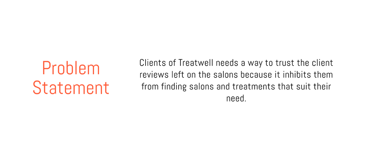
I decided to work with this app because it is to be honest, an app that frustrates me. I like their idea and I am a former customer. But in the end I just had to uninstall the app. The reason for this is that in my opinion the quality of the treatments does not correspond with the reviews given in the app.
The solution
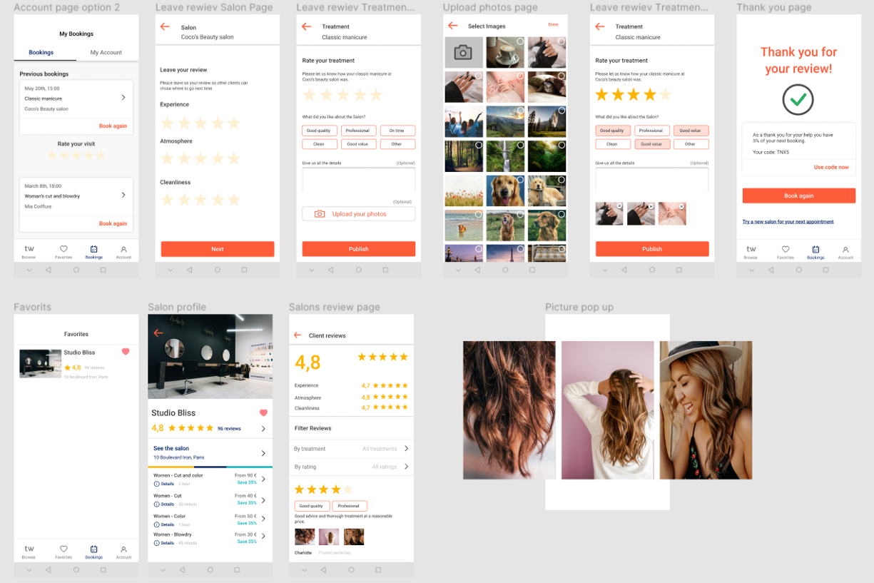
Based on user research I conducted, the solution to the clients problem was to add the feature of uploading photos to the client reviews. In this way the potential clients which are searching for beauty establishments will have the posibility to look at the reviews and photos taken from actual clients before booking the appointments. And therefore have a better chance to judge the treatments by seeing the real results before desiding on a salon.
Empathize - The first step in the design process
We started with researching the problem. We were all surprised by what we found, according to our research the French museums did not seem to go through a crisis. We found numerous sources about the crises other countries were experiencing however as we were focusing on France, we did not include those findings.
Research
I started the assignment by doing some research. I looked at reviews left on the play store and online. I then did some quick user interviews.
Common critics of the app was:
“I stopped using it when I was disappointed in the treatment even though the salon had top reviews on the app”
“I want to be able to buy gift cards and send to my friends directly with the app”
“There are no filters for men and women”
“I can’t change my comment after I have written it”
I decided to work with the first problem as it was the one that was mentioned most frequently and was the main issue for the people I interviewed.
Competitor feature analysis
I performed a competitor feature analysis to understand more about the competitors and to see what features they had compared to Treatwell. I first conducted a general feature analysis to help me get an overview over what the apps proposed. After I decided on the feature to focus on, I conducted a more specific analysis.
Proto persona
I created a proto persona to visualize who I was designing the feature for, based on my assumptions and the research
Problem and Hypothesis statement
I used problem statement and hypothesis statements to define my problem in a user sentric way and to find a solution.
User Flow
To ideate on how to implement the feature and how it would look I used the crazy 8 method. When I had decided on where and how to implement my feature I created a user flow. In the user flow the person adds a review with a photo as well as checking the reviews of a salon to show how the photos would look in the review page.
Wireframes
To draw out the user flow and the new feature I used pen and paper and sketched out Lo FI Wireframes. After modifying them a few times I created the Mid FI Wireframes.
I actually did not have access to all the frames in this user flow. Because you have to have had booked and been to an appointment with Treatwell in the last three months. I had not. So some of the wireframes are replicated of the app, some are replicates of the app with some changes and some are imagined. In addition I added a small extra feature to the reviews. In the app it is not possible to add tags to the comments however I believe it really facilitate the review prosses and I got great feedback on it in my testing so I kept it.
Usability test
I performed 5 useability tests and made some changes to the wireframes after the feedback:
Rate treatment page: Changed the text of the button from “Upload photos” to “Upload your photos”
Rate treatment page after photo is added: Removed the “Upload photos” button and added a “add more” icon.
Thank you page: Added the discount section and changed how the button and link was situated.
HI-fi Prototype
Components
I did not use components on my Mid-fi because of time issues so I wanted to get the wireframes tested before creating them as well as preserving my Mid-fi when creating the Hi-fi.
I identified where it would make sense to create components and created them. I was really satisfied when I learned how to create variants and interactive components.
Design review
After the presentation of my project we had a design review where we got feedback from teachers and our peers. I made some changes based on those feedback;
Thank you page: I originally had a checkmark with a shadow but as Treatwell has a flat design I was advised to change the it for a flat one.
Thank you page: The first text was too low
Next steps
To test the Hi-Fi and make changes accordingly
Add the “add more photos” icon to the “review page”
Change the font
Thank you so much for taking the time to read my case study. Do not hesitate to leave a comment.


